Driving Business Performance Through Workforce Analytics: An HR Dashboard Showcase
Exploring how data visualization can provide actionable insights for workforce management and business strategy using Excel and Tableau for cleaning, formatting, and visualizations.
Key Takeaways for Managers
For busy leaders, here are the core insights and actionable capabilities the HR Analytics Dashboard provides:
- Quickly understand workforce size, growth, and turnover trends to inform strategic planning and capacity management.
- Gain immediate visibility into team distribution by department and location for efficient resource allocation and organizational design.
- Explore workforce demographics (Gender, Age, Education, Performance) to support diversity initiatives, succession planning, and talent development.
- Analyze compensation patterns to ensure pay equity and develop competitive salary strategies based on key workforce segments.
- Drill down to individual employee details for operational tasks like talent identification, team management, and supporting HR processes.
Table of Contents
In today's dynamic business landscape, an organization's competitive edge is increasingly defined by its people. Effectively managing, developing, and retaining talent is no longer just an HR function; it's a strategic imperative that directly impacts profitability, innovation, and long-term sustainability. However, many leaders face the challenge of making critical decisions about their workforce without clear, actionable data.
This project addresses that challenge head-on. I've developed an HR Analytics Dashboard designed to transform raw human resources data into strategic intelligence, providing executives and decision-makers with the insights needed to navigate workforce complexity and drive business success.
Dataset Details
The dataset used for this project was synthetically generated to simulate typical enterprise HR data while incorporating specific characteristics to enable meaningful analysis. The data includes detailed records for approximately 8,000 employees. Data cleaning and initial formatting were performed using Python (with Pandas) and Excel before loading into Tableau for visualization.
The dataset used for this project was synthetically generated to simulate typical enterprise HR data.
Here is an overview of the key attributes included in the dataset:
- Employee ID: A unique identifier.
- First Name: Randomly generated.
- Last Name: Randomly generated.
- Gender: Randomly chosen with specific probabilities (46% Female, 54% Male).
- State and City: Randomly assigned from a predefined list.
- Hire Date: Randomly generated with custom probabilities for each year (2015-2024).
- Department: Randomly chosen from a list with specified probabilities.
- Job Title: Randomly selected based on the department, with specific probabilities.
- Education Level: Determined based on the job title from a predefined mapping.
- Performance Rating: Randomly selected from defined categories with specified probabilities.
- Overtime: Randomly chosen with specific probabilities (30% Yes, 70% No).
- Salary: Generated based on the department and job title, within specific ranges.
- Birth Date: Generated based on age group distribution and job title requirements, consistent with hire date.
- Termination Date: Assigned to a subset (11.2% of total) with specific probabilities, at least 6 months after hire date.
- Adjusted Salary: Calculated based on gender, education level, and age, applying specific multipliers and increments.
Key Formulas
Below are key calculated fields used in Tableau to derive metrics. The formulas are syntax-highlighted for readability.
- Total Active
- Total Terminated
- Length of Hire
- Status
// Total Active: Counts employees with no termination date
COUNT(IF ISNULL ([Termdate]) THEN [Employee ID] END)
// Total Terminated: Counts employees with a termination date
COUNT(IF NOT ISNULL ([Termdate]) THEN [Employee ID] END)
// Length of Hire: Calculates tenure in years
IF ISNULL ([Termdate])
THEN DATEDIFF('year', [Hiredate], TODAY())
ELSE DATEDIFF('year', [Hiredate], [Termdate])
END
// Status: Categorizes employees as 'Hired' or 'Terminated'
IF ISNULL ([Termdate]) THEN 'Hired'
ELSE 'Terminated'
END
Understanding the Data Foundation and Business Need
The journey to creating an effective HR Analytics Dashboard begins with understanding the critical business questions that need answering and identifying the necessary data. Raw HR data, while abundant, often resides in disparate systems and requires careful processing to become a reliable source of insights.
For this project, the data foundation consisted of typical employee records, including information on demographics, employment status, departmental assignments, compensation, and performance ratings. The initial step involved gathering this data and ensuring its cleanliness and structure. This phase is paramount;
reliable insights can only emerge from reliable data.
Using tools like Excel and Tableau for data cleaning and preliminary formatting was essential to prepare the dataset for analysis and visualization.
This process highlighted the inherent business need: how to transform these rows and columns of data into a format that allows executives to quickly grasp complex workforce trends, identify potential issues like pay gaps or high turnover, and inform strategic decisions without needing to sift through detailed reports. The goal was to build a tool that provides immediate answers to pressing questions about the organization's most valuable asset.
Visualizing Strategic Workforce Insights - The Executive Overview
With the data prepared, the next step was to design a dashboard that provides clear, strategic insights at a glance, tailored for an executive audience. The goal was to move beyond simple tables and reports to create a dynamic, interactive tool that highlights key trends and patterns.
The goal was to move beyond simple tables and reports to create a dynamic, interactive tool that highlights key trends and patterns.
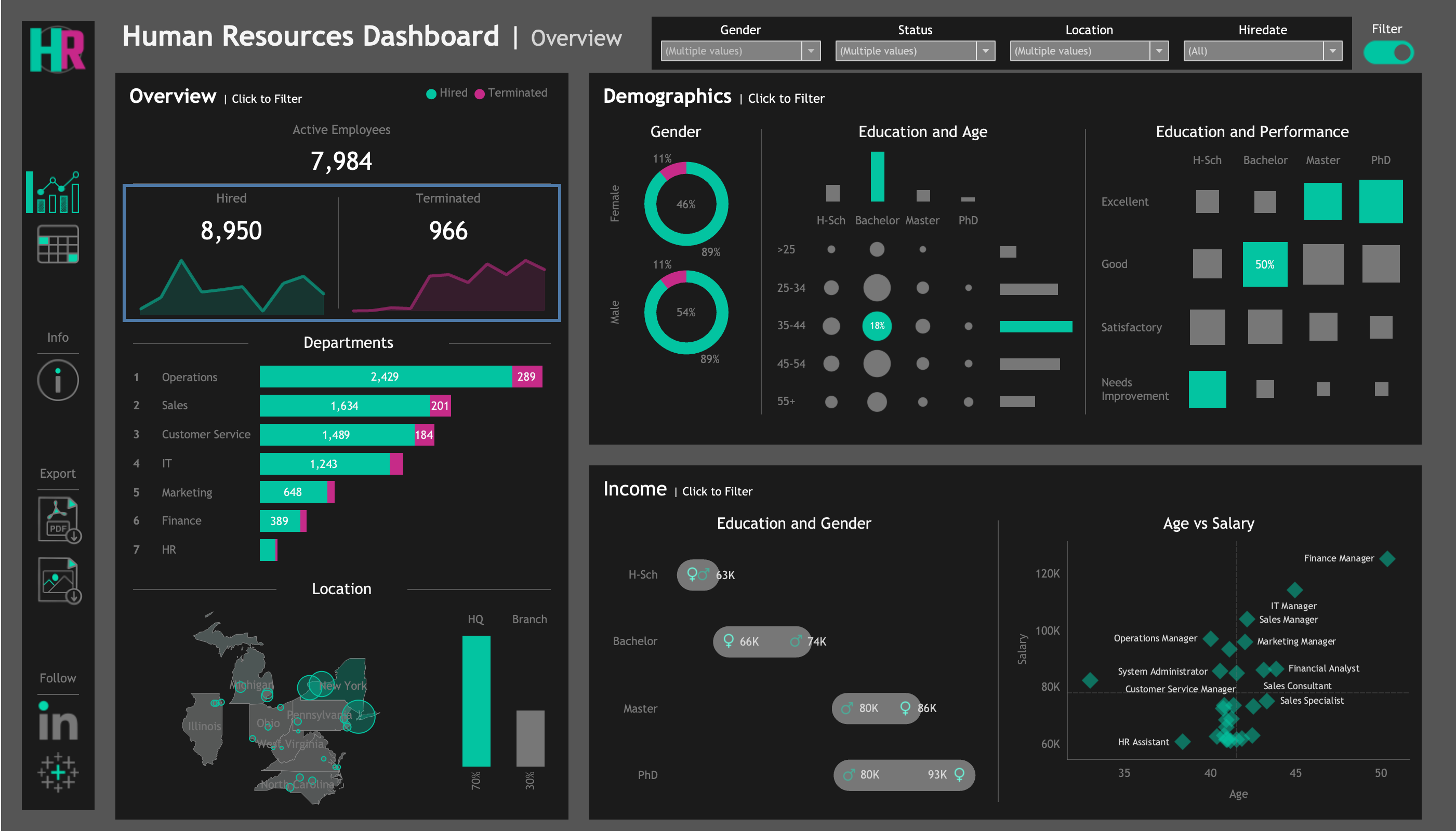
Figure 1 shows the primary overview page of the HR Analytics Dashboard. This view is designed to act as an executive summary, providing immediate visibility into the most critical aspects of the workforce.
View the interactive HR Analytics Dashboard on Tableau Public
This executive overview presents several key areas:
Workforce Size and Trends
- Insight: Dashboard highlights Active Employee count 7,984, with 8,950 Hires and 966 Terminations.
- Implication: Provides a clear picture of net workforce change and overall growth momentum, crucial for strategic workforce planning and managing operational capacity.
- Insight: Trend lines visually illustrate the history of hiring and attrition over time.
- Implication: Easy to identify periods of rapid expansion or potentially concerning increases in turnover, informing proactive management.
Departmental and Location Breakdown
- Insight: Dashboard provides a clear breakdown by Department (e.g., Operations largest with 2429, Sales follows with 1634).
- Implication: Vital for resource allocation and understanding the size of each team.
- Insight: Location breakdown shows split between HQ in New York (approx. 70%) and branches across USA (remaining 30%).
- Implication: Crucial for organizational design, understanding talent distribution, and planning regional support structures.
Workforce Demographics
- Insight: Presents Gender distribution (approx. 46% Female, 54% Male).
- Implication: Provides a high-level view of gender balance, supporting diversity initiatives.
- Insight: Visualizations show concentration in certain age groups (e.g., 35-44 range) and across education levels (e.g., large segment with Bachelor's).
- Implication: Key for planning for succession as the workforce ages and assessing collective educational qualifications and potential skill sets.
- Insight: Visual explores the correlation between Education and Performance.
- Implication: Offers insights into how formal qualifications relate to performance ratings, informing talent development strategies.
Compensation Patterns
- Insight: Enables visual comparison of average salaries by Education and Gender (e.g., Master's degree holders around $80K).
- Implication: Critical for analyzing pay equity and spotting potential differences across segments.
- Insight: ‘Age vs Salary’ visualization explores how compensation progresses with age.
- Implication: Provides insights into how experience and tenure are rewarded, informing compensation strategies.
Drilling Down for Operational Detail
While the executive overview (Figure 1) provides critical strategic insights, operational HR functions and departmental managers require the ability to access and analyze more granular employee data. This need is met by the detailed employee view within the dashboard.
Figure 2 shows the 'Employee Details' section, designed to serve as a dynamic and filterable employee roster.
This filterable list provides detailed information for each employee, supporting operational tasks and deeper data exploration.
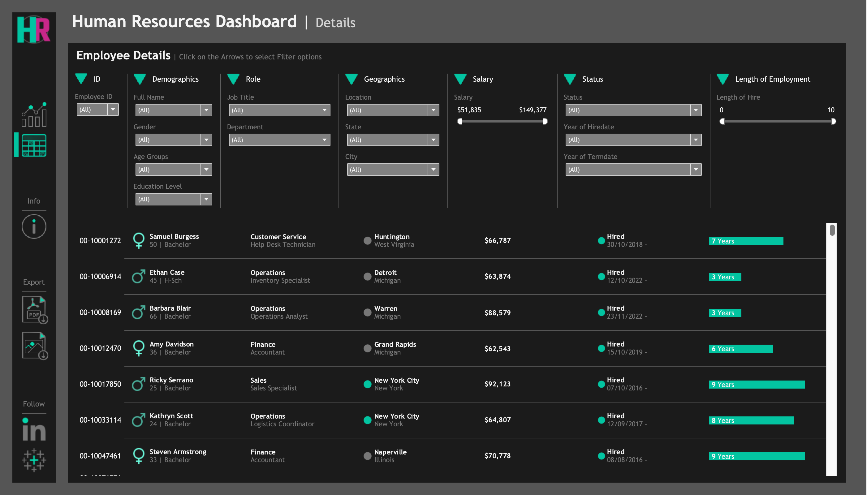
Explore Employee Details in the HR Analytics Dashboard on Tableau Public
The significant value of this view lies in its robust filtering capabilities, which empower users to quickly segment the workforce based on various criteria visible at the top of the view. This is invaluable for numerous operational and tactical tasks:
- Targeted Talent Identification: Quickly find employees within a specific Department with particular Education Levels or a certain Length of Employment for forming project teams or identifying candidates for internal mobility.
- Scenario: Review Team for Annual Planning. A department manager filters by their 'Department' to easily see the full roster, employee status, and length of employment for planning workload and development needs.
- Scenario: Analyze Recent Departures. Filter by 'Status' = 'Terminated' and 'Termination Date' within a specific range to examine the details of employees who have recently left the organization.
Connecting Strategic Insights to Detail: This detailed view allows users to "drill down" and investigate the specific employee records that contribute to the high-level trends seen in the overview (Figure 1). For example, if the overview highlights increasing turnover in a particular department, this view can be filtered to examine the details of the employees who have left that department, aiding in root cause analysis.
Conclusion
In conclusion, the ability to leverage data analytics in Human Resources is no longer a luxury but a strategic necessity for any organization aiming for sustained success. As demonstrated through this project, a well-designed HR Analytics Dashboard can transform complex workforce data into clear, actionable intelligence.
By providing a comprehensive view of workforce size, trends, demographics, compensation patterns, and detailed employee information, this dashboard empowers executives and managers to make data-driven decisions that optimize talent management, ensure equity, improve operational efficiency, and inform strategic planning. It moves the HR function from reactive reporting to proactive, strategic partnership.
This project exemplifies my commitment to using data to solve real-world business challenges and drive positive organizational outcomes.
Through the development of this dashboard, I've applied key skills in data cleaning, analysis, visualization, and, most importantly, translating technical data into meaningful business insights and value propositions.
Let's connect or discuss this project:
Connect on LinkedIn