Behind the Dashboard: My Workflow Analyzing the Superstore Dataset
Exploring the process, techniques, and considerations when working with retail sales data using Python, SQL, and Tableau.
Working with real-world datasets is crucial for honing data analysis skills. The Superstore dataset, a popular example in the analytics community, provides a rich opportunity to practice extracting meaningful information from retail sales transactions. It includes details on sales, profit, product categories, customer segments, and geographic locations.
For my "Superstore Sales Insights" project, my focus wasn't just about finding specific answers, but about applying and refining a robust data analysis workflow, specifically concentrating on the visualization phase in Tableau. This post details the steps I followed, the tools I used, and some general considerations for anyone working with similar datasets, assuming the data has already been cleaned and structured.
Starting Point: Clean & Structured Data
A fundamental prerequisite for effective visualization is having data that is already clean and appropriately structured. For this project, the Superstore data was prepared using Python (Pandas) and SQL to handle missing values, correct data types, and ensure consistency. This meant the data was ready to be connected to Tableau and used directly for visualization and analysis.
The dataset contained approximately 9,994 rows of order details, covering sales from 2014 to 2017. Key attributes included Sales, Profit, Quantity, Discount, Product Category/Sub-Category, Customer Segment, and Geographic details like Region and State.
Essential Retail Metrics for Visualization
Understanding retail performance relies on key metrics. Beyond simple counts, metrics like Sales, Profit, Quantity, and Discount are fundamental. However, combining these can yield deeper insights. A particularly crucial metric for profitability analysis is the Profit Ratio. It provides context for profit figures by showing profit as a percentage of sales, helping differentiate high-revenue, low-margin products/regions from lower-revenue, high-margin ones.
Formulating Key Metrics in Tableau (Calculated Fields)
Tableau's Calculated Fields are essential for creating these derived metrics directly within the visualization environment. This allows for dynamic calculations based on the data.
For instance, calculating the Profit Ratio involves a simple formula applied across rows, then aggregated:
// Tableau Calculated Field: Profit Ratio
SUM([Profit]) / SUM([Sales])
This formula calculates the sum of profit and divides it by the sum of sales for the context of the current view (e.g., for a specific state, category, or the entire dataset).
Other valuable calculated fields might include Sales per Customer or Profit per Order, helping to understand the value generated from each transaction or customer:
// Tableau Calculated Field: Sales per Customer
SUM([Sales]) / COUNTD([Customer ID])

// Tableau Calculated Field: Profit per Order
SUM([Profit]) / COUNTD([Order ID])
Using these calculated fields ensures consistent metric definition throughout the dashboard and allows you to analyze performance beyond simple totals.
Visualizing Performance: Principles and Application
Choosing the right visualization is key to making data understandable and revealing patterns. The type of data and the question being asked dictate the best chart type. Here are some examples applied to the Superstore data:
Geographic Performance (Maps and Comparisons)
For visualizing geographic data like sales or profit by state or city, a map is highly effective. It immediately shows spatial patterns and regional variations. You can also compare aggregate metrics across regions using different chart types, like bar charts comparing multiple key performance indicators (KPIs).
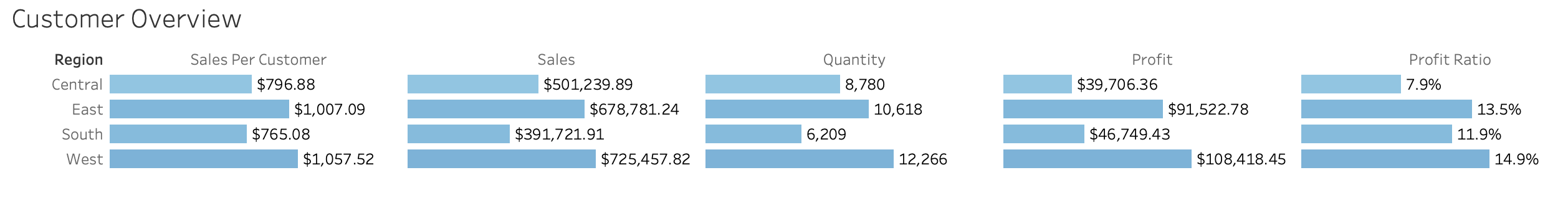
In Tableau, creating maps often involves assigning geographic roles to fields like 'State' or 'City'. Comparing regions across multiple metrics, as shown above, uses bars with measures on the columns or rows shelf and dimensions on the other.
Categorical Comparisons (Bar Charts)
When comparing metrics across distinct categories like Product Category, Customer Segment, or Region, bar charts are typically the clearest choice. They make it easy to compare values side-by-side.
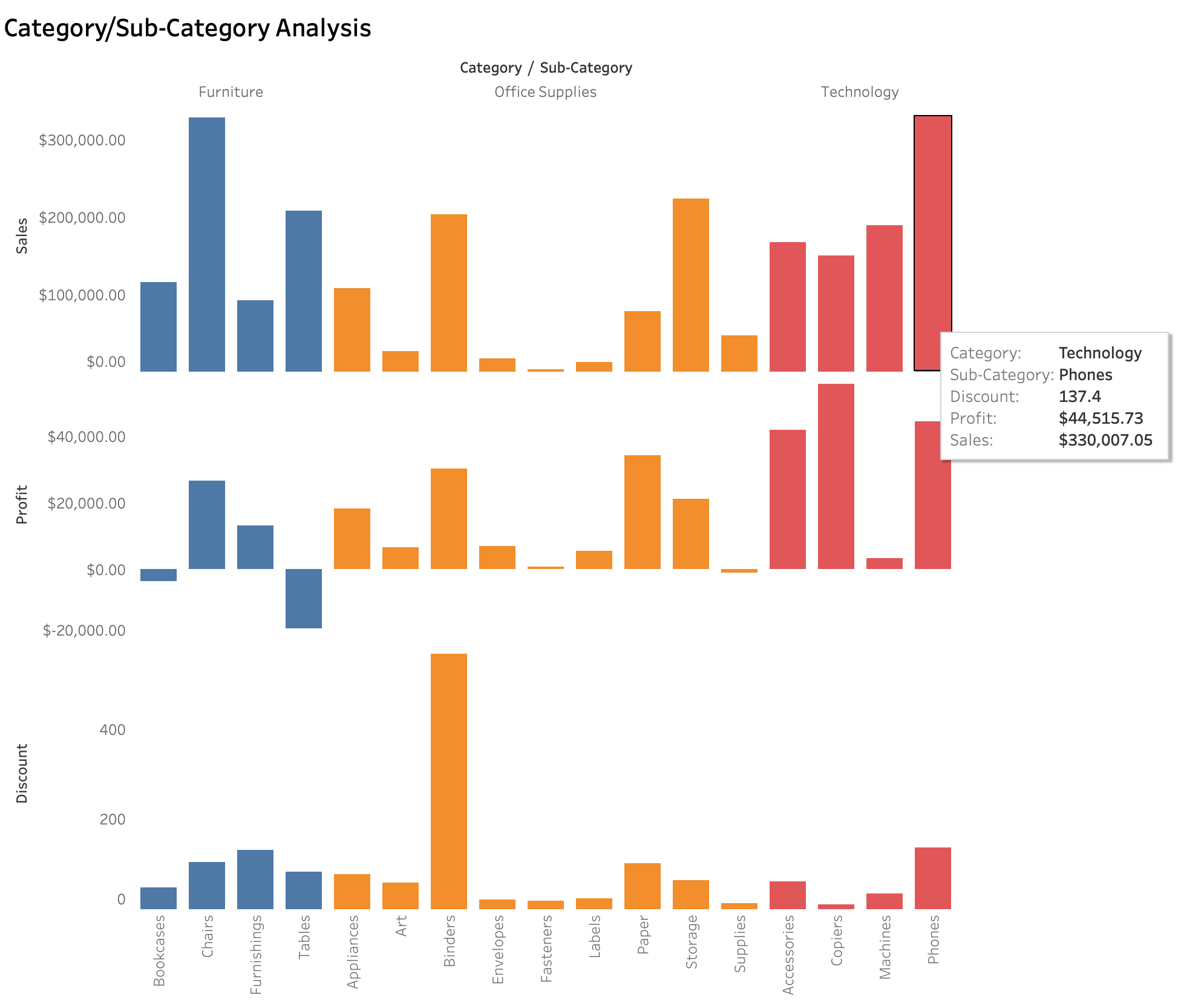
Using consistent color palettes for categories and sorting bars (e.g., sorting by the metric value) can further enhance readability and highlight top/bottom performers.
Hierarchical or Part-to-Whole Analysis (Treemaps)
To visualize hierarchical data or show how different categories contribute to a total (part-to-whole), a treemap is a useful chart type. Size typically represents a quantitative metric like Sales or Profit, and color can represent another metric or category.
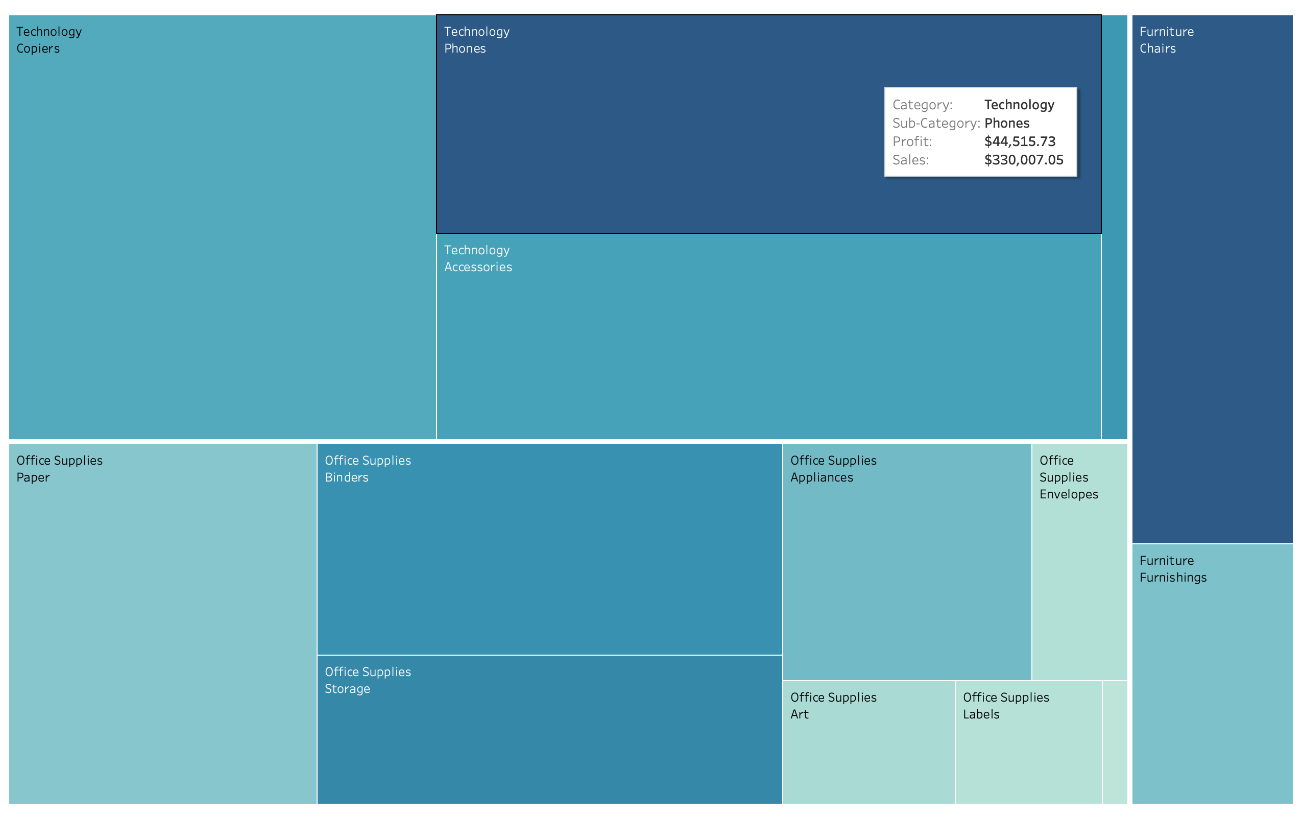
Treemaps are effective for quickly spotting the largest contributors within a hierarchy and understanding their relative proportion of the total.
Understanding Relationships (Scatter Plots)
To explore the relationship between two quantitative metrics, like Sales and Profit for each customer, a scatter plot is useful. It can help identify correlations, clusters, or outliers.
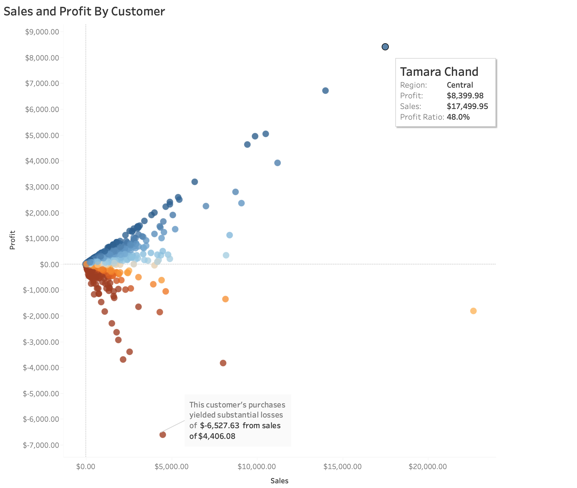
Each point represents a single customer. Color encoding (e.g., by Region or Customer Segment) or sizing by another metric (e.g., Quantity) can add further dimensions to the analysis in a scatter plot.
These are just a few examples, but the principle is consistent: match the chart type to the data type and the question you want to answer visually.
Enhancing Dashboards with Interactivity
Beyond individual charts, combining them into interactive dashboards in Tableau allows users to explore the data more deeply and gain personalized views.
Dashboard Actions
Dashboard Actions connect different elements, enabling users to filter, highlight, or navigate by clicking on a visual mark. This allows the dashboard to respond dynamically to user interaction.
For a Superstore dashboard, useful actions include:
- Filter Actions: Clicking on a state in a map filters other charts on the dashboard to show data *only* for that state. Clicking on a product category in a bar chart filters other charts to show performance *only* for that category. This is configured in the Dashboard menu under Actions.
- Highlight Actions: Hovering over a bar or mark in a chart highlights the corresponding data points in other related charts, visually connecting data across views.
Actions make the dashboard a tool for exploration, guiding users through related data points across different visualizations.
Parameters for Flexibility
Tableau Parameters add significant flexibility by allowing users to input values that can change calculations, filters, or even which dimension or measure is displayed. They are powerful user controls that make dashboards dynamic.
Examples in a Superstore dashboard:
- Metric Swap: A parameter lets the user choose to view Sales, Profit, or Profit Ratio across the same axis in multiple charts using a calculated field that references the parameter value. This allows users to dynamically switch the metric being displayed.
- Top N Control: A parameter allows the user to dynamically select the number for a 'Top N' filter (e.g., view Top 5, Top 10, Top 20 states by sales). The parameter value is used within a filter or calculated field controlling the rank.
- Discount Threshold: A parameter lets users input a percentage to filter to see only orders with a discount *above* that user-defined threshold. This parameter value is used in a boolean calculated field applied as a filter.
Parameters empower users to customize their view of the data without needing to edit the workbook, enhancing the dashboard's utility.
Key Considerations & Best Practices for Tableau Visualization
Creating effective data visualizations involves more than just dragging and dropping fields. Keeping these best practices in mind helps ensure clarity and impact:
- Do simplify: Remove unnecessary chart elements, redundant labels, or distracting backgrounds (chart junk). Focus on the data ink that represents the data itself.
- Don't overload: Avoid trying to fit too much information onto a single chart or dashboard. Aim for clarity over density.
- Do choose the right chart: Select the visual type that best represents the relationship or pattern in your data (e.g., lines for trends, bars for comparisons, maps for geography, scatter plots for relationships).
- Don't rely on default formatting: While Tableau defaults are decent, customize colors, fonts, and tooltips for improved readability and alignment with your brand or purpose.
- Do use color purposefully: Use color to encode data (e.g., color intensity for quantity) or to distinguish categories. Use consistent colors for the same categories or metrics across views.
- Don't use too many colors: Avoid a chaotic color palette that confuses the viewer. Limit the number of distinct colors used unless encoding a continuous variable.
- Do label clearly: Ensure titles, axes, legends, and tooltips are informative and easy to understand, and accurately reflect the data being shown. Tooltips are great for providing detail on demand.
- Do think about your audience: Design the dashboard and visuals with the intended users, their level of data literacy, and their potential questions in mind. What story do they need to see?
- Do test interactivity: Ensure filter actions, highlight actions, and parameters work as expected and enhance, rather than hinder, data exploration. Get feedback from potential users.
Challenges Encountered (Visualization Focus)
Focusing specifically on the visualization and dashboarding phase in Tableau presented its own set of challenges. One notable challenge was structuring the interactive dashboard layout to ensure filter actions applied intuitively across all relevant sheets without causing confusion or unintended filtering when users clicked on different visuals. This required careful planning of the dashboard's flow and precise configuration of the action filters. This required careful planning of the dashboard's flow and precise configuration of the action filters.
Learnings and Takeaways
This project provided valuable lessons specifically related to data visualization and using Tableau effectively:
- Mastering Calculated Fields is fundamental for transforming raw data into meaningful metrics directly within Tableau, enabling deeper analysis beyond just raw columns.
- Understanding dashboard actions is crucial for building interactive experiences that empower users to explore data dynamically by connecting different visualizations.
- Parameters provide powerful control to the end-user, allowing for highly flexible and customizable views and enabling scenario analysis.
- Effective visualization is an iterative design process; it requires experimentation to find the clearest and most impactful way to represent data patterns.
- Applying core visualization principles like appropriate chart choice, thoughtful use of color, and clear labeling significantly impacts how easily patterns are perceived and understood by the audience.
- Thinking about the end-user's potential questions helps guide the design of interactive elements, making the dashboard a more useful tool.
Tools Used for Visualization
For the visualization phase of this project, the primary tool was Tableau.
Data preparation was handled beforehand using Python (Pandas) and SQL.
Conclusion
Focusing on the visualization workflow with the Superstore dataset in Tableau highlights the critical steps in transforming clean data into understandable and interactive visuals. By effectively using Calculated Fields to define metrics, choosing appropriate chart types based on visualization principles, and enhancing the user experience with Dashboard Actions and Parameters, it's possible to create powerful tools for data exploration.
This process underscores that effective visualization is both a technical skill and a thoughtful design exercise, essential for making data accessible and useful for pattern recognition.
See the full interactive dashboard and the specific insights derived from these visualizations on my portfolio project page:
View Full Project DashboardExplore the data preparation code on GitHub:
View Code on GitHubLet's connect or discuss this project:
Connect on LinkedIn